08 / Brand & Identity
Sobat Energy Solutions
Energy.
With a clear signature.
Design study
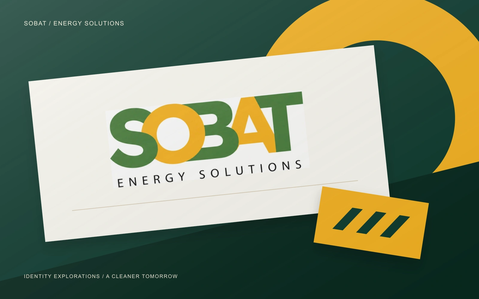
Three identity directions exploring visibility, connection and the energy transition.
The scope
- Brand & Identity
- Spaces & Experience
The point of view
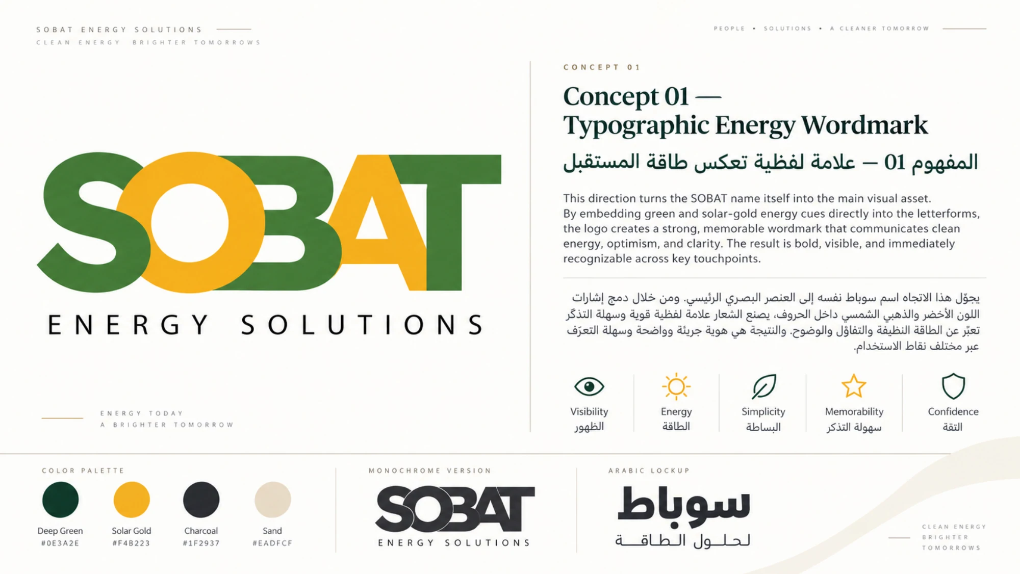
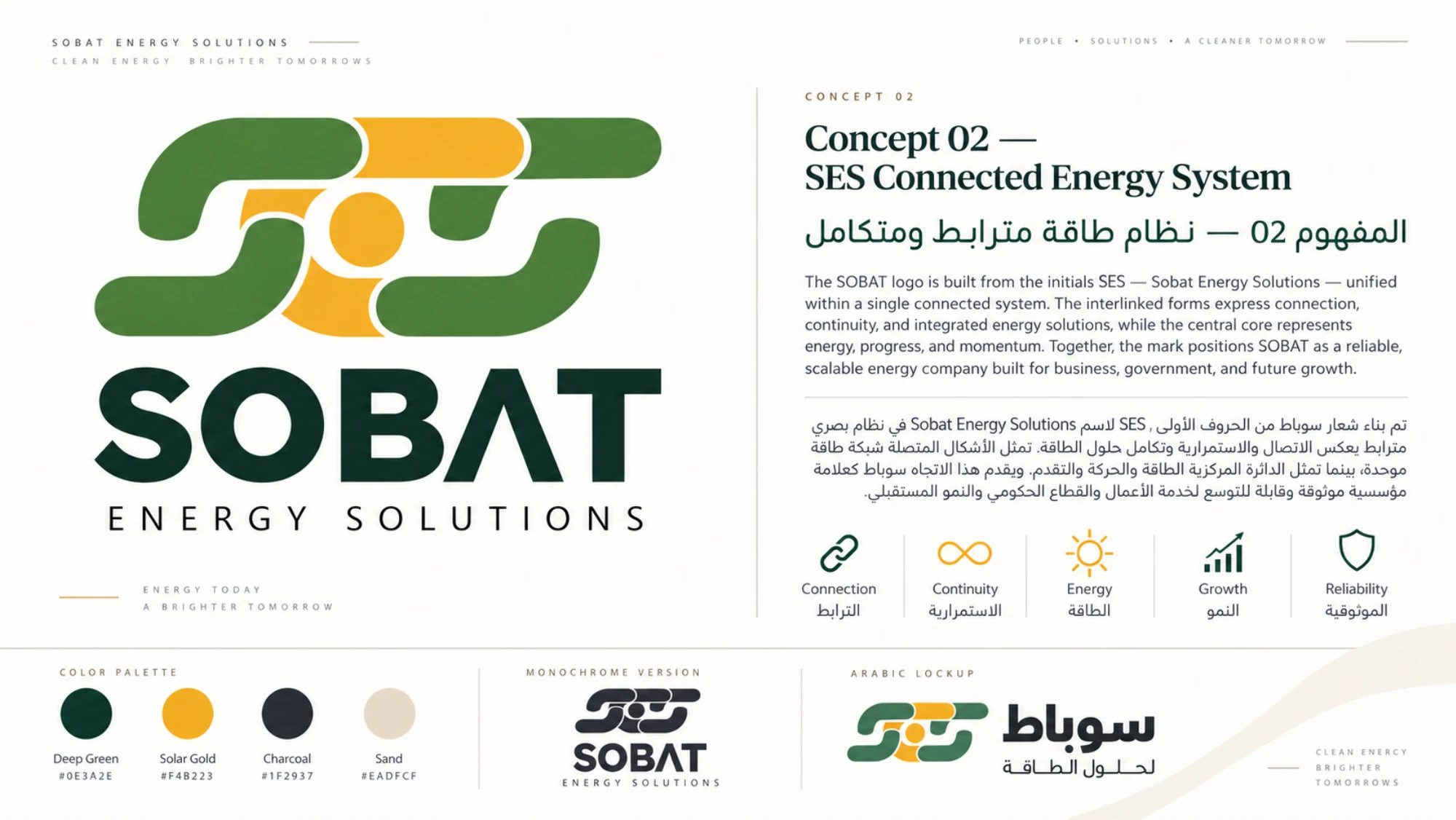
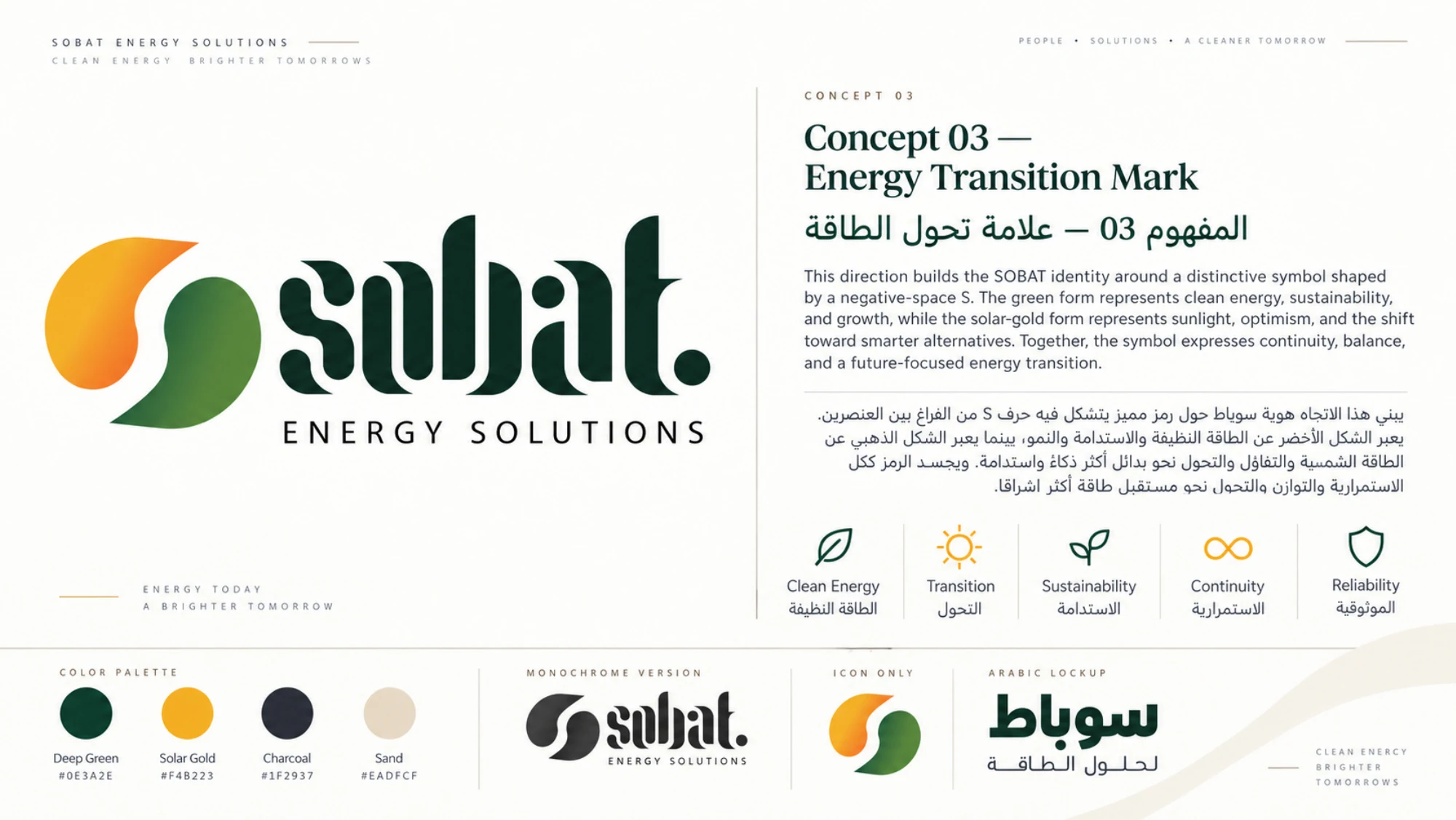
The Sobat identity study explores three distinct routes: a typographic wordmark, a connected SES system and an energy-transition symbol.
The expression
A shared green and yellow palette is tested across building signage, vehicles, generators, workwear and stationery. The alternatives reveal how a system behaves beyond the logo.
In detail.
06 selected views
Brand & Identity
Spaces & Experience
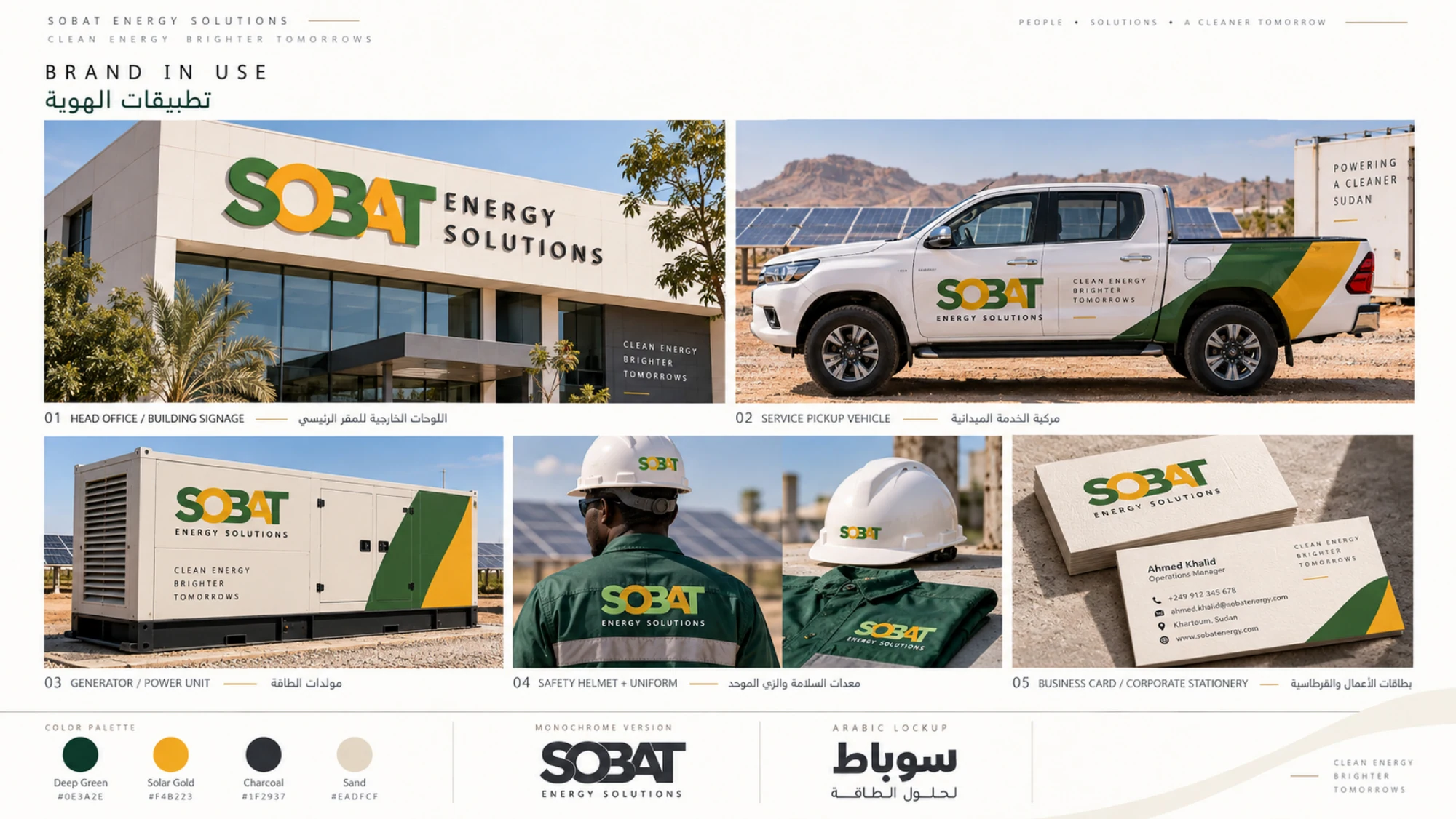
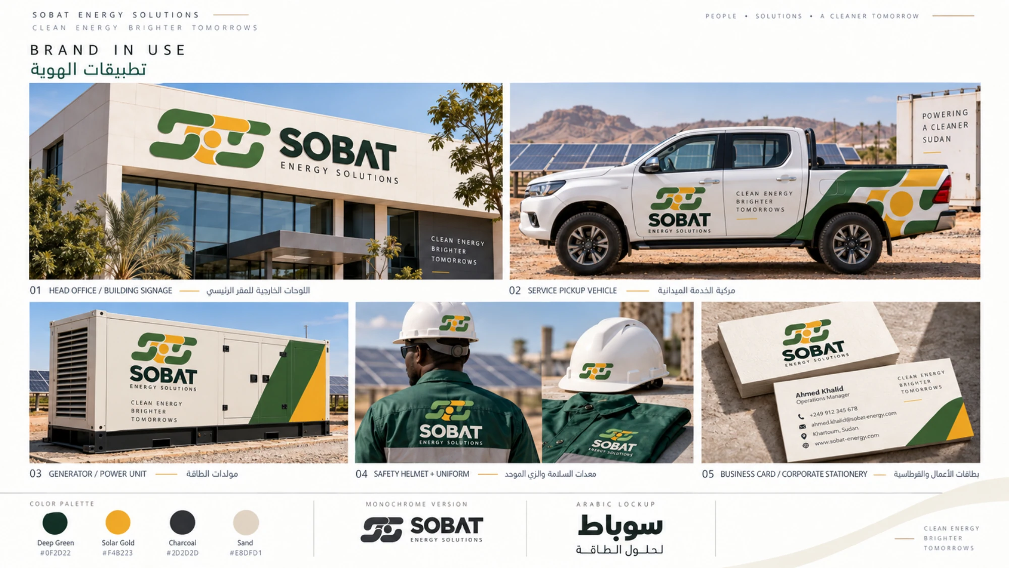
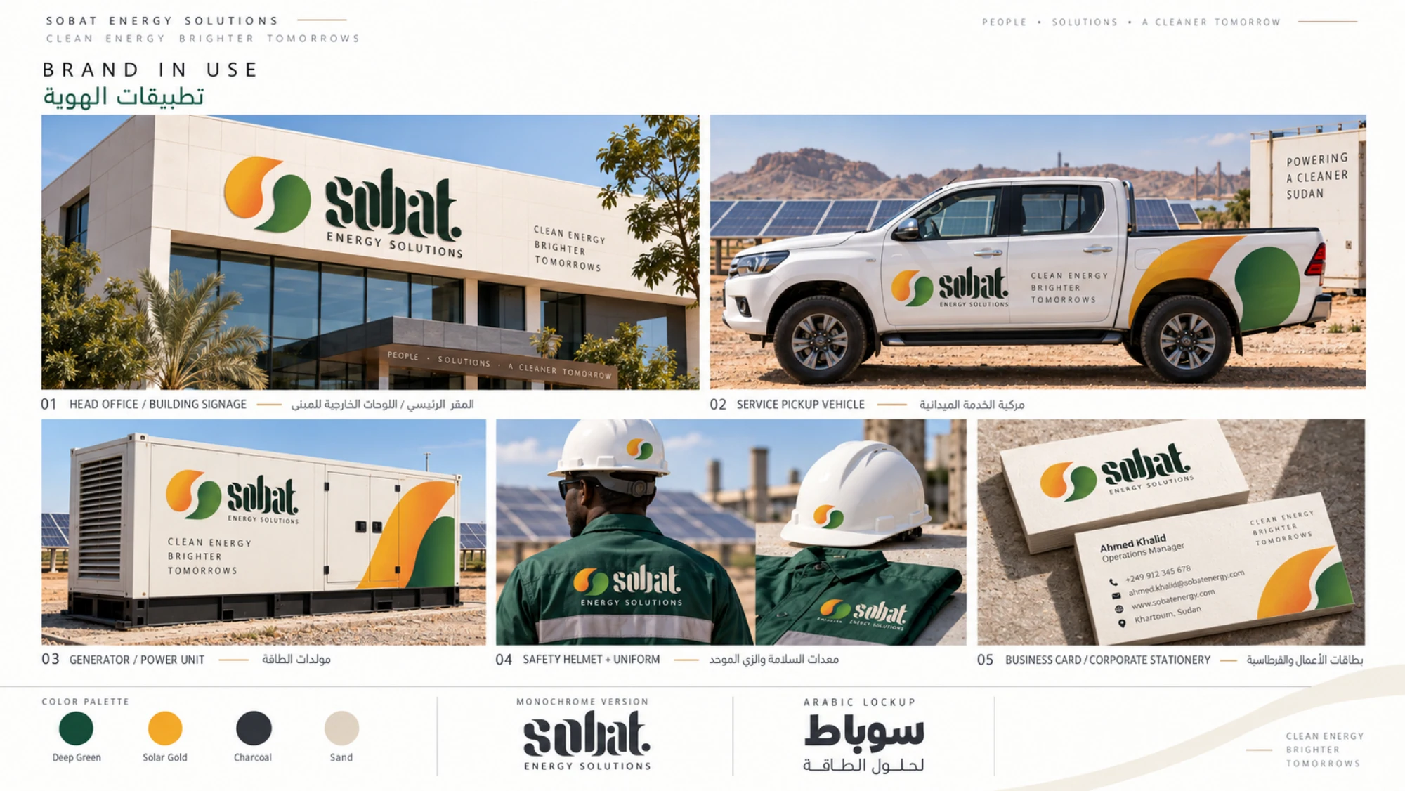
Identity options and conceptual applications.